Chromatic
Geography

scroll

Using images as data, I built a pipeline to extract dominant colors from urban photography and aggregate them into city-level palettes of 6 colors each.

The dataset: 1,800 images across 12 cities.

How does this work?

Using a single image from Tokyo, let me walk you through exactly what the algorithm does.

Tokyo Sensoji Temple

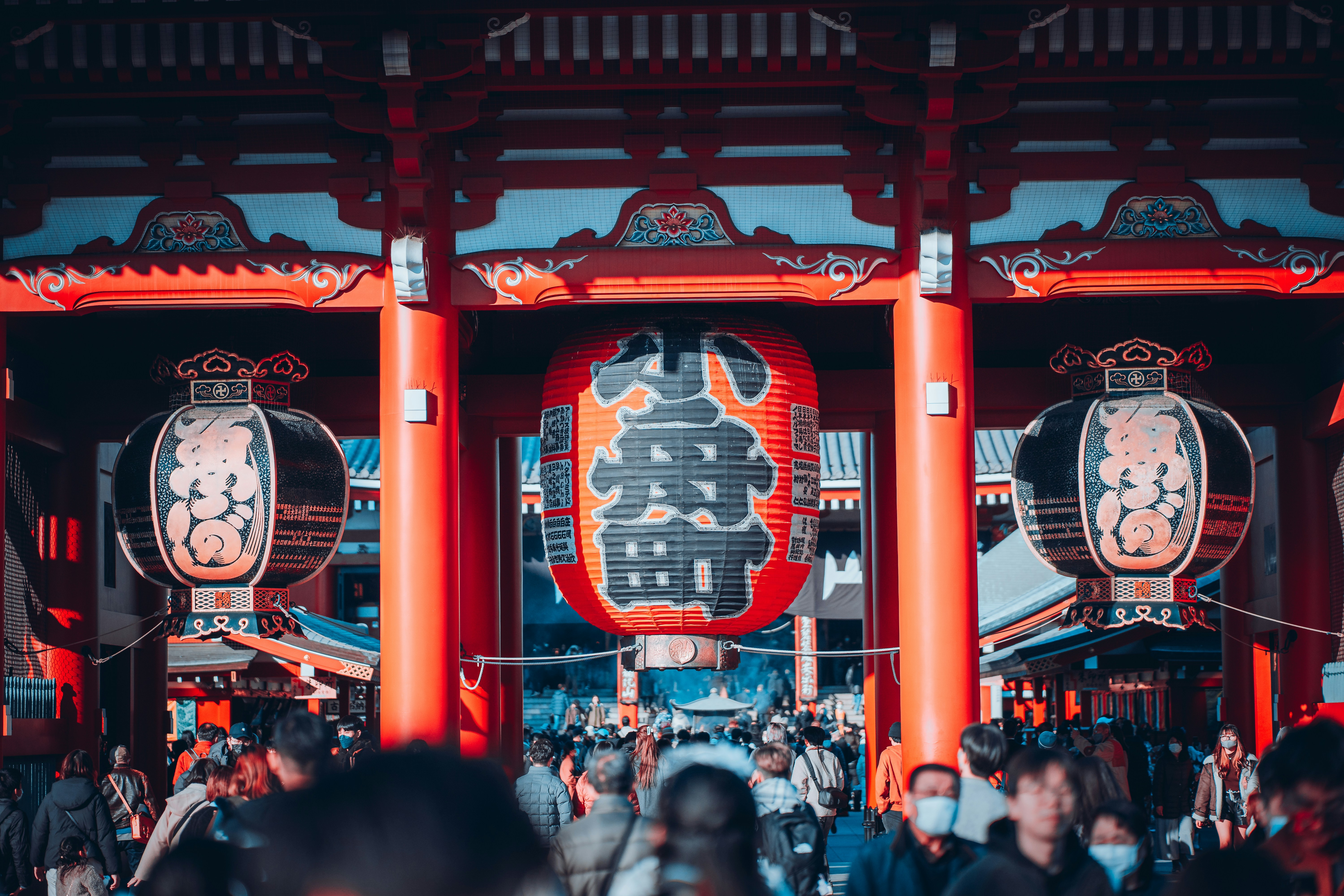
sensoji_temple_001.jpg

360,000 pixels

(201, 70, 61)
(26, 58, 74)
(212, 165, 116)
(139, 45, 35)

Each pixel = (R, G, B)

Red → ↑ Green

Pixels plotted in "color space"

All 360,000 pixels

Step 1: Everything in one box

Warm
Cool

Step 2: Cut along biggest range

Step 3: Repeat until we have 6 distinct boxes

One image's palette

6 colors extracted

Start with an image

This is Sensoji Temple in Tokyo, with red lanterns, wooden beams, and crowds of visitors.

Every image is an array of pixels.

Zoom in far enough, and any photo becomes a grid of tiny colored squares. A 600×600 image has 360,000 pixels.

How do we simplify 360,000 colors down to just 6?

Each pixel can be represented by 3 numbers.

Every color is stored as (R, G, B) — how much red, green, and blue light it contains.

(201, 70, 61) = The red lantern
(26, 58, 74) = The shadowy blue

Plotting pixels in a 3D color space

Imagine a 3D box where X = red, Y = green, Z = blue. Every pixel becomes a point in this space.

Therefore, similar colors cluster together.

The Algorithm: Median Cut

Median Cut, used by the ColorThief library, starts by putting all pixels into a single, merged container.

Cut the box in half

Find which color channel (R, G, or B) has the biggest range. This is the axis (R,G, or B) along which there is the largest (minimum-maximum) value. Cut the box in half along that axis at the median.

Continue the process.

From the resulting two boxes, take the box with the most variation and cut it along the median again, increasing the number of boxes by 1 each time.

The algorithm repeats until we have 6 boxes, and the average color of each box becomes one of the six final palette colors.

The Result

From 360,000 pixels down to 6 representative colors of a single image. This is a single image's color palet

Post-processing filters out very dark and gray colors from sidewalks, roads, and concrete to focus on more vibrant essence.

How do we aggregate this for a whole city?

I'll use Tokyo as an example. I extracted colors from 150 photographs, which included temples, streets, neon signs, markets, and trains.

150 images from Tokyo × 6 colors extracted from each = 900 total colors. Here are some example palettes from other images:

I then clustered similar colors, and found the most frequently appearing, or dominant colors:

Tokyo

A palette representing temples, lanterns, night lights, and wooden architecture

The Aggregation Process

  1. Extract 6 colors from each of 150 images
  2. That gives us 900 colors total
  3. Cluster similar colors and count frequency
  4. The 6 most common become the city's palette

This way, outlier photos don't skew results so that the palette reflects what's consistently present.

12 Cities

After analyzing 1,800 photographs across 12 cities, here's what the algorithm found.

Bangkok

Thailand

Warm reds and golds from temples, markets, and night markets

Marrakech

Morocco

Teal tiles, terracotta architecture, spice market coral

Singapore

Singapore

Tropical green, glass towers, Marina Bay blue

Santorini

Greece

Aegean blues, iconic whitewash

Rio de Janeiro

Brazil

Jungle greens and bright carnival colors

Melbourne

Australia

Earthy olive greens and laneway street art

Mexico City

Mexico

Creamy neutrals, clay earth, and terracotta

Jaipur

India

Sky blue and palace-pink sandstone tones

Havana

Cuba

Teals, warm ochre, and coastal pastel

Copenhagen

Denmark

Frosted blues, soft lavender, and muted hygge warmth

Istanbul

Turkey

Bosphorus blues meet bazaar gold

Tokyo

Japan

Vermillion accents over warm wood and night lights

Insights

Patterns from comparing the 12 cities side by side.

Visualizing Color Temperature

"Warm" and "cool" are perceptual qualities that I attempted to approximate mathematically. Since warm colors (red, orange, yellow) have high R values and cool colors (blue, cyan) have high B values:

temperature = (R - B + 255) / 510 × 100
// 0 = pure blue, 50 = neutral, 100 = pure red

For each palette, I averaged the temperature of all 6 colors, with Green as roughly neutral benchmark (~50).

The Warm ↔ Cool Spectrum

Cities ranked by average color temperature

CoolWarm

More Side-by-side Comparisons

Temperature opposites

Bangkok and Santorini are the warmest and coolest cities in the dataset.

Bangkok
vs
Santorini

Same temperature, different palettes

Melbourne and Rio show what two palettes with the same color temperature (exactly 62°) can look like.

Melbourne
=
Rio

Almost monochromatic

Santorini is the only city with a nearly single-hue palette - 5/6 colors are variations of blue.

5 blues + 1 white

Unexpected similarities

Tokyo and Mexico City form the algorithm's most similar pair despite different climates and locations. Both built from warm earth tones, vermillion, and terracotta.

Tokyo
=
Mexico City

Saturation spectrum

Bangkok's palette averages 79% saturation, while Copenhagen sits at the opposite end, at 41%. Tropics versus the Nordic climate.

Bangkok: 79% sat
vs
Copenhagen: 41% sat

The garden city

Singapore is the only city where green is the dominant hue. Garden City lives up to its name, with hints of the blue glass buildings in the skyline.

Singapore

Bonus: New York City

I was expecting grey concrete and glass. Instead, the algorithm found something different. Upon analyzing the photos, here's what I think the colors represent:

Yellow cabs
Red brick & fire escapes
Central Park greenery
Brownstones
Old brick
Limestone & new concrete buildings

The city's most photographed icons, along with the glass & concrete skyline, are 19th century brick, yellow cabs, and the deep greens of Central Park.

1,800
photographs analyzed
10,800
colors extracted
72
final palette colors